HSA Administrator | B2B Self-ID Module

4
Client
[Leading HSA Admin.]
Year
Nov. 2023 - July 2025
Site
https://zaneoa.com

The Challenge

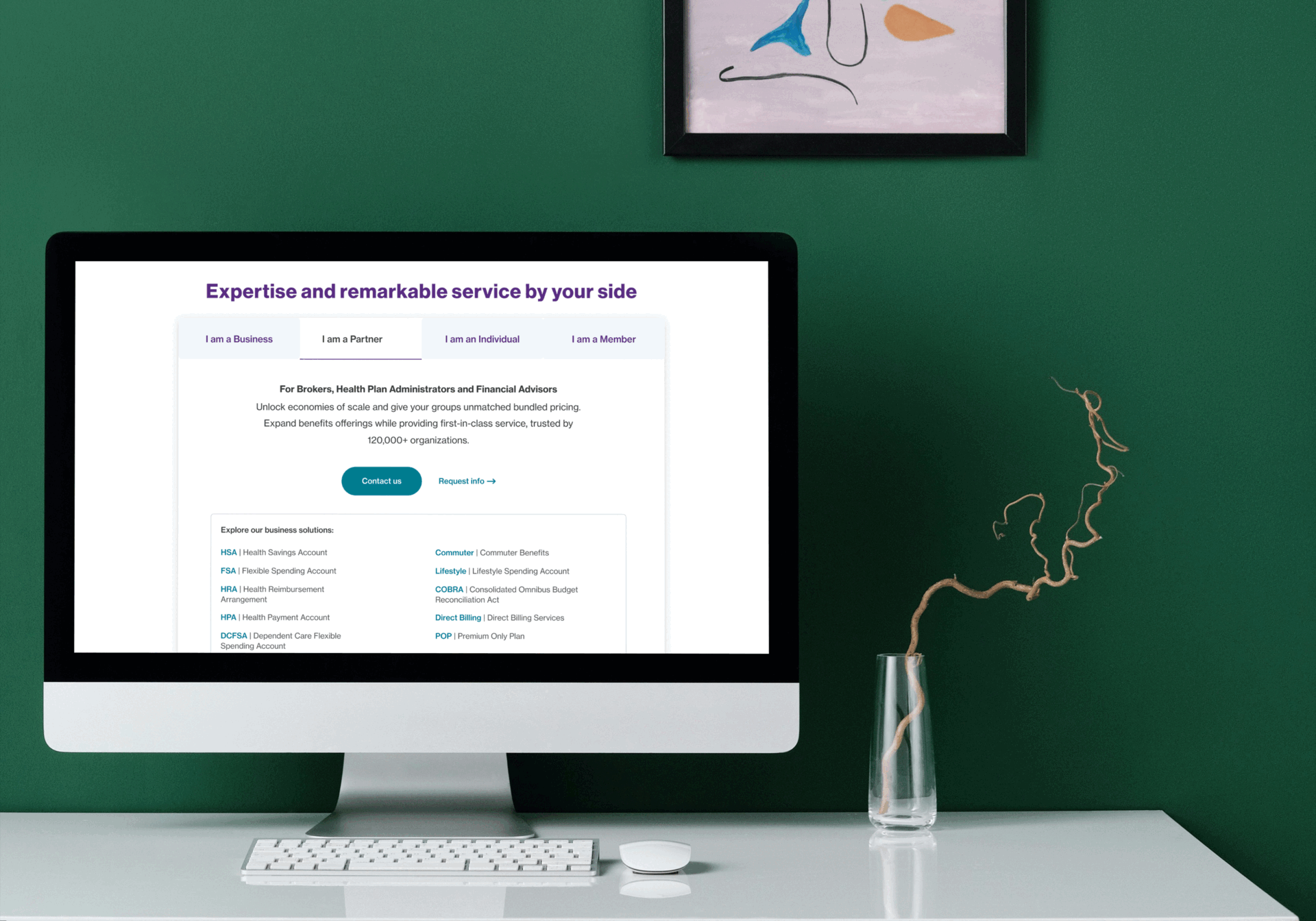
What Opportunity Were We Maximizing?

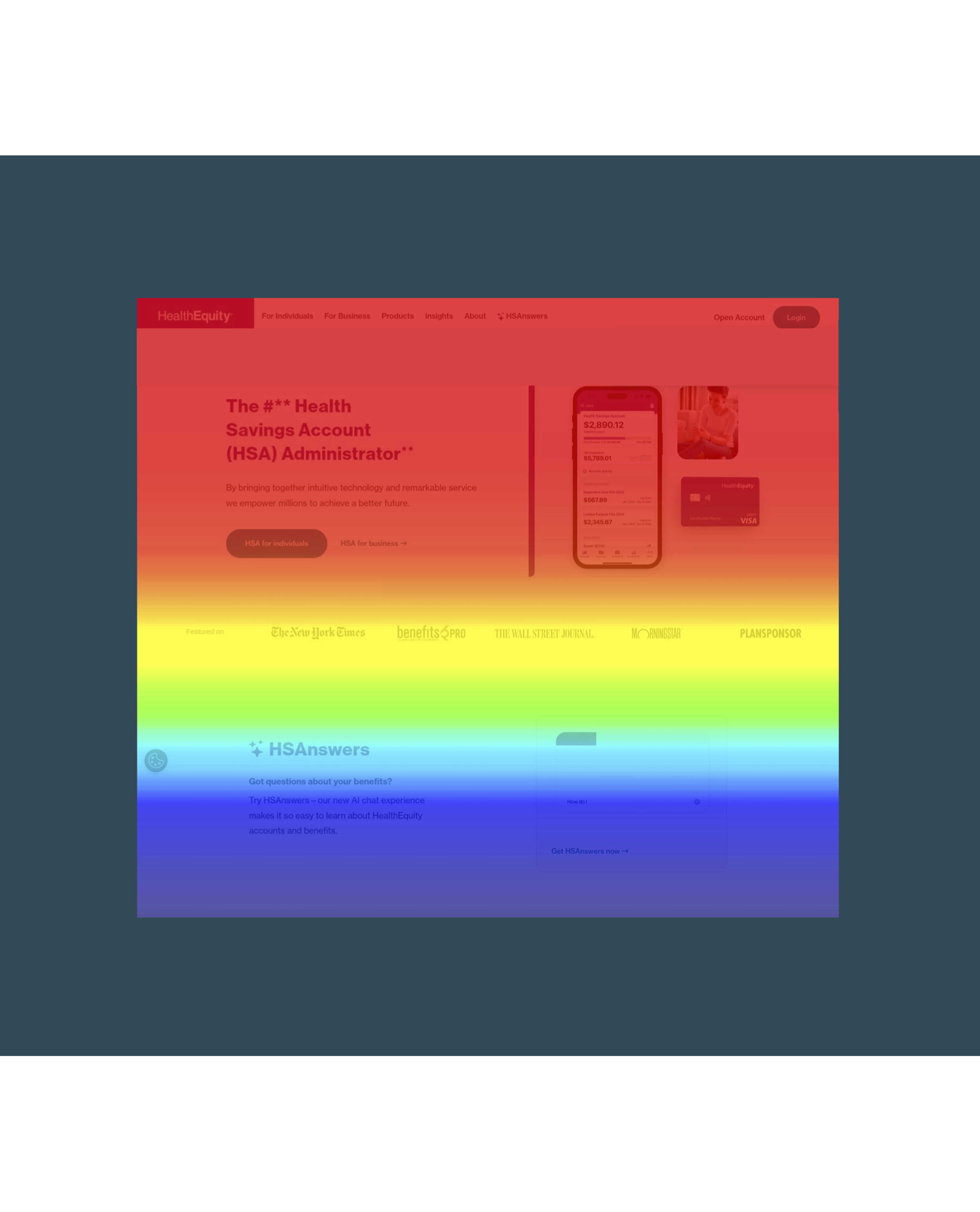
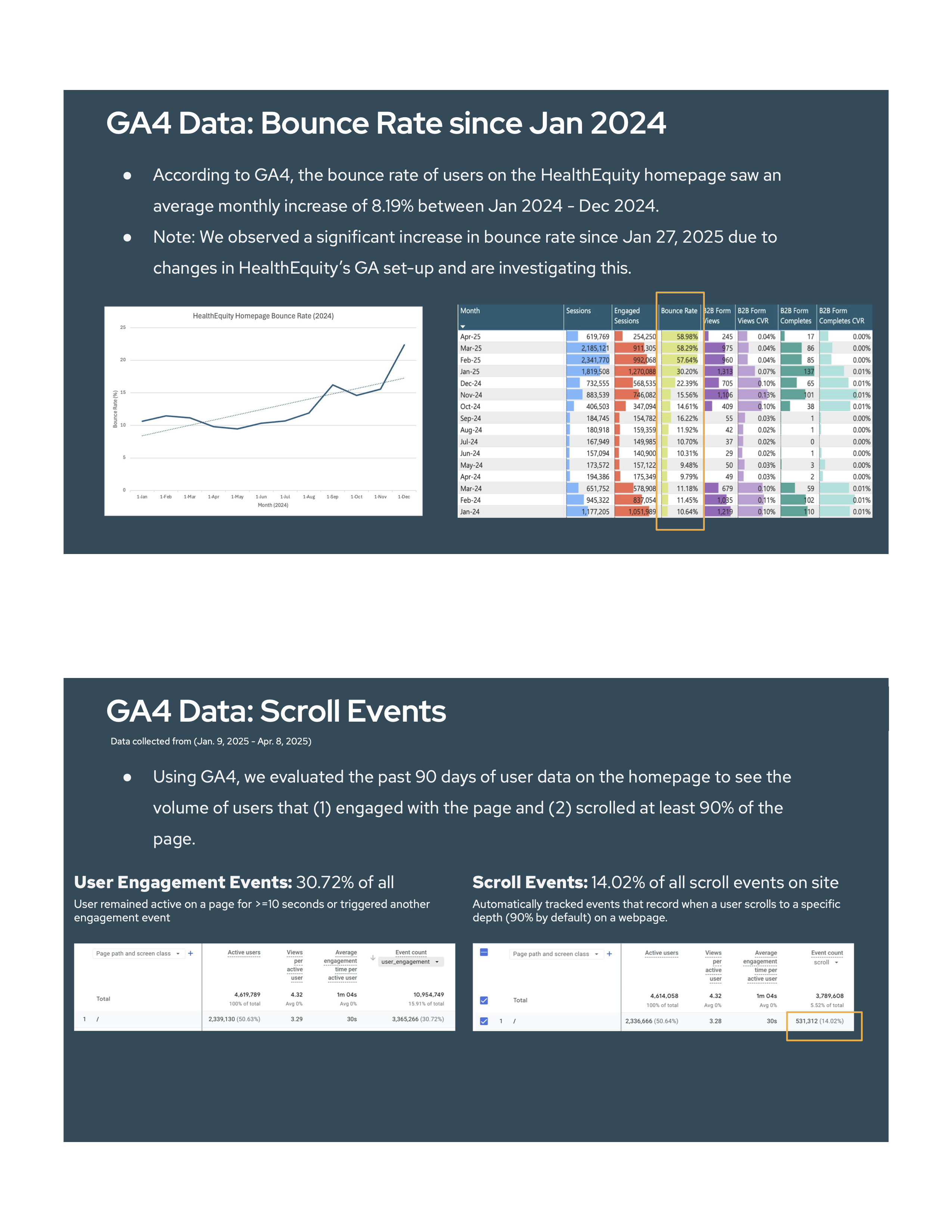
The homepage of a leading HSA administrator was a critical entry point but was inadvertently creating user confusion and frustration. Users, particularly B2B prospects, struggled to self-identify and navigate to relevant information, leading to increasing bounce rates [an average monthly increase of 8.19% from Jan. -Dec. 2024, with a significant spike in 2025].

High return rates to the homepage after logging in [50% mobile, 42% desktop] screamed for a clearer, more intuitive pathway. This wasn't just a UX issue; it was a significant business barrier.

My Role

Driving the Solution

As Product Designer, I took the lead on dissecting this core usability problem. My responsibilities spanned from initial qualitative research to orchestrating cross-team workshops to ensure alignment on the solution. I was tasked with not only redesigning the B2B Self-ID experience but also creating a scalable framework that would improve the overall user journey and reduce friction for all user types.

The Journey

My Data-Driven Design Process

We began with robust problem validation, using Hotjar recordings to visually confirm user struggles – watching B2B users scroll endlessly, interact with irrelevant sections, and then exit. Data Analysis (GA4) corroborated this, revealing escalating bounce rates and frustratingly high return rates to the homepage after users had already logged in. This indicated a fundamental breakdown in guiding users to their necessary resources.

Based on these insights, I designed a strategic proposed solution: a clear, intuitive tabbed Self-ID Module with distinct categories for Business, Partner, Individual, and Member users. This was about providing explicit pathways. To validate this, I developed a detailed Usability Testing Plan for remote, moderated sessions with a balanced mix of B2B and B2C participants.

We defined success metrics like task completion rates and first-click results, ensuring we'd gather precise feedback on effectiveness, clarity, and visual hierarchy. I also analyzed existing CTA engagement to strategically determine the optimal placement for this critical new module.

The Solution

Bringing the Vision to Life

The core solution was the elegant, tabbed Self-ID Module. This clear, explicit interface immediately guides users to their relevant content, drastically reducing guesswork and misdirection. The design prioritized visual hierarchy and intuitive interaction, ensuring a smooth, efficient self-identification process that catered to the diverse needs of the user base.

The Impact

Quantifying Success for Users and Business

This project was designed to significantly improve user experience by ensuring users are effectively guided to relevant information, leading to successful completion of core self-identification tasks. By reducing user frustration and dramatically cutting down on misdirected traffic, the solution was poised to reduce bounce rates and enhance overall conversion efficiency.

While specific post-implementation metrics from this exact module's launch are to be verified, similar strategic UX interventions have demonstrably contributed to overall client satisfaction improvements and improved user clarity [as seen in other projects], directly impacting the critical B2B acquisition funnel.

Reflections

Lessons Learned and Future Growth

This project deeply reinforced the critical importance of precise user segmentation and self-identification on complex platforms. It honed my ability to translate deep analytical insights from tools like Hotjar and GA4 into clear, actionable design solutions. It also underscored the value of meticulous usability testing planning as a non-negotiable step in validating design effectiveness and ensuring user success.

{Key Tools} Google Analytics 4, Hotjar, Figma

{Project Type} B2B User Journey Optimization, Usability Testing, Information Architecture